
I helped an architect shape an identity from scratch.
New in town and with a small work-from-home practice, Michael Howells required a website that would put him toe-to-toe with established brick-and-mortar firms. Collaborating closely with agency Smith & Connors, I provided strategy support and content writing, to enhance visual assets and entice well-matched prospective clients to meet with Michael.
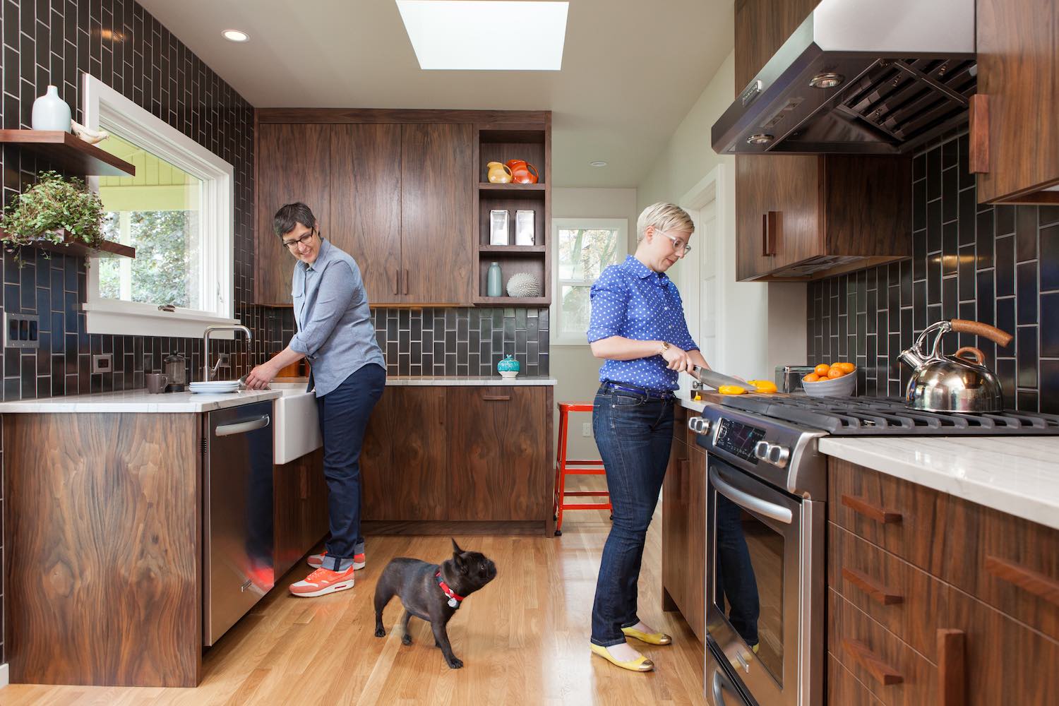
We dug deep to distill this architect’s core strengths and connect him with his main audience: medium- to high-budget homeowners.
Architect websites typically focus on buildings. Our strategy centered on people: him, his audience, and his past clients. For the copy, I used a palette of elegant but plain words. No jargon. A focus on tactile experiences and thoughtful, personal details emphasize the humanity at the heart of this business.
My work for Howells Architecture + Design continues. It includes newsletters, editorial pitches, and press releases.

FLAVOR: clean, subtle, balanced
When you’re looking for a designer, images come first, but text matters too. This architect’s aesthetic is pared-down but meticulously detailed, rigorous but warm. The tone of the website copy reflects these complementary qualities. Balancing image and description also took some finesse: too much type detracts from the designs; too little and the architect feels remote.

MEAT
Residential architects should be approachable. Most architects’ websites are aloof. To invite the audience in, we let our “People First” strategy determine the big moves:
• We culled projects to preclude user fatigue.
• We favored projects with homeowners in the photos.
• We provided optional layers of depth to each project page, reinforcing the bespoke nature of this practice.
• We broke down the client’s approach into clear steps, demystifying the process of working with an architect.
JUICE
Refined, detail-driven work tailored to individual clients. We squeezed every part of the site for a maximum serving of this message.
• We made the portfolio into pleasing human stories, with an editorial-style layout, and client testimonials working like quotes in a magazine piece.
• We titled projects by clients’ first names, rather than type (kitchen remodel, etc.).
• Small, judicious text decisions—e.g., repeating the + sign in the brand name in project headings and body copy—imbue the writing with the same considered, patterned detailing found in the client’s work.